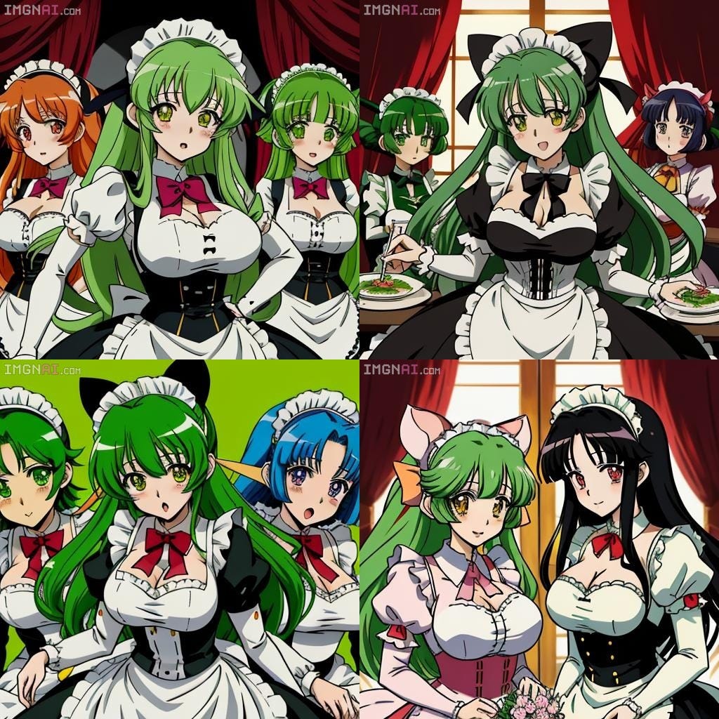
I was feeling sad last night and made the decision to work on a design project that had been lingering in my mind since 2021: designing a mock Japanese Visual Novel website.
Previously, I had attempted this several times on Figma, but I lost motivation due to the overwhelming number of design choices. On a whim, I decided to try using Canva instead.
The first thing I did was come up with a name for a typical moe-kei visual novel from the early 2000s, also known as the "y2k" era. Names like Milk, Cream, Ribbon, and Berry popped into my head. Eventually, I settled on "Milk Maid," stylized in Hiragana. Canva surprised me with its wide range of Japanese fonts, and I easily found one that matched the style I was going for.
Next, I decided to use ImgnAI, an anime AI tool, to generate some results that aligned with my vision. It took a few attempts and different prompts, but I eventually obtained some images that I was pleased with. The tool also provided good alternatives to what I ultimately chose for my project.
My final design for Milk Maid is below! I went with a mid-2000s aesthetic for both the anime style that I selected as well as the decor of the website.
Initially I felt limited by Canva. This is a common experience in design — some tools that are really beginner friendly can leave you feeling restricted in choice. The inverse of that is Figma, which I consider myself to be pretty proficient at, feeling too mechanical at times. I later realized that Canva had more capabilities that I had not initially seen. I would probably use Canva again but it would be cool to try this over in Figma to see what I could come up with.
Next, I re-imagined this style of UI for modern times. I know that game websites look quite different now (than what I designed) but my goal was to create an “updated” version of the style of homepage I made for MilkMaid. This is “Cyber Angel!” The character designs are again from IMGNAi but the landscape of the “neo-tokyo” is from a google search. I tried a fresher font style, an updated anime style and notably I used a gradient in the background of the homepage. I see gradients everywhere in the West now. My experience is that Japan is leaning more into the neon-Asian maximalist style for some design but I also saw some gradients there earlier this year.
Overall, this was a fun distraction and something I wanted to work on for a while. In the future, I’d like to do an in depth case study on Japanese UI in general—which is interesting to say the very least. Please let me know what you think. Which game would you like to play more?


I would prefer playing the first one! I miss things being so cute.
I guess the things we got used to before our brain was fully developed will always feel more comfortable and better to us.
I also just hate everything with “neo” in front of it. It usually ruins the thing.